Basic & More is built on a simple but powerful idea: the joy of discovery. In their physical stores, customers rarely arrive with a shopping list. Instead, they wander in, explore, and leave with something unexpected.
The challenge appears when that experience moves online. While the stores feel inspiring, playful, and ever-changing, the existing webshop struggled to communicate the same sense of curiosity, urgency, and warmth. The task was to explore how a digital experience could better reflect the in-store feeling while supporting business goals like conversion, retention, and accessibility.
Understanding the brand and its shoppers
Basic & More operates in the intersection between low-price retail and lifestyle inspiration. Their assortment consists of rest lots, surplus goods, and own-brand products, often in limited quantities and changing weekly.
Research showed that the core audience is women aged 25–65 with a strong interest in home, design, and value-driven shopping. They are price-conscious without wanting to compromise on aesthetics, and they actively seek the feeling of making a good find.
Two recurring insights stood out across research and analysis:
• Users visit for inspiration, not efficiency alone
• The sense of “what do they have today?” is central to the brand’s appeal
Where the digital experience fell short
While the physical stores encourage exploration, the webshop felt static and transactional. Users described it as visually flat and disconnected from the brand’s playful identity.


Several key issues emerged:
• Limited sense of newness or urgency
• Weak storytelling around products and rest lots
• Lack of a clear digital equivalent to browsing the store
• Accessibility considerations were not consistently implemented
This created a gap between expectation and experience. Users knew the brand from the physical stores, but did not feel the same excitement online.
From browsing shelves to scrolling discoveries
Instead of starting with features, the concept started with behavior. How do people actually move through a Basic & More store?
They stroll, pause, notice something unexpected, and move on again. That rhythm became the foundation for the core concept: a digital experience built around short, curated discoveries rather than endless product grids.
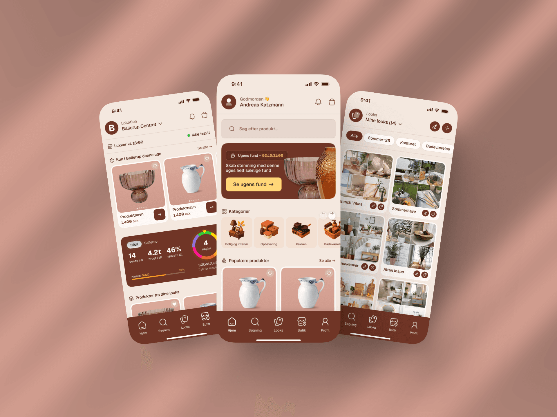
This led to the idea of “Ugens fund” – a small, carefully curated selection of 3–5 standout products that change weekly and act as the primary entry point to the webshop.
Designing for urgency, not overload
The “Ugens fund” experience is intentionally limited. By showing only a handful of products at a time, attention stays focused and decision-making becomes easier.
Each product is presented as its own moment, supported by subtle micro-interactions, clear stock indicators, and a countdown to the next drop. The goal is not pressure, but presence – reminding users that these finds are temporary.
This mirrors the physical reality of limited rest lots while encouraging repeat visits and habitual engagement.
Extending the experience beyond the webshop
To explore long-term potential, the concept was expanded into an app-based vision. Here, the idea of discovery continues through features like saved favorites, curated moodboards, and push notifications for new weekly drops.
Rather than replacing the webshop, the app acts as an inspiration layer – strengthening loyalty and making Basic & More a recurring part of the user’s digital routine.
Accessibility and inclusion by design
Accessibility was treated as a core quality parameter rather than a final checklist. The solution was designed to meet WCAG 2.1 standards from the outset.
This included:
• Sufficient color contrast across brand colors
• Keyboard-navigable interactions
• Clear hierarchy and readable typography
• Alternative text for all product imagery
The result is an experience that feels inclusive without feeling restrictive – accessible design that still supports the brand’s playful tone.
The outcome
The final concept demonstrates how a retail experience rooted in spontaneity and surprise can be translated into a digital context without losing its soul.
By shifting focus from full assortments to curated moments, the solution supports both user needs and business goals – increased engagement, stronger brand recognition, and a clearer connection between physical and digital touchpoints.
The key learning from this project is that good digital commerce is not about showing more products. It is about creating the right reasons to come back.

