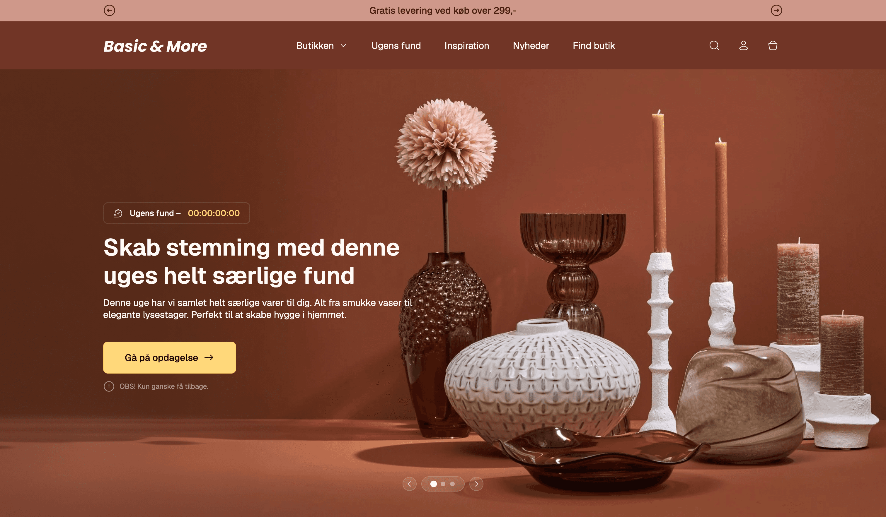
Overview
Basic & More is a Danish home and interior chain with a genuinely unusual model: the assortment changes every week. They buy job-lots, overstock, and seconds from known brands and sell them on cheap, so the shelves are never quite the same twice. In the stores that's the whole appeal — you go in to see what's landed. Online, none of that came across. The webshop was static and a bit flat, and it didn't explain the one thing that makes the brand interesting.
This was our second-semester exam project on Multimedia Design at IBA Kolding, done for the real brand. I worked in a group of four and owned the brand direction, the design, and the frontend build. The brief we set ourselves was simple to say and hard to do: take the feeling of going on a find in the physical store and rebuild it online.
The problem, grounded
We didn't want to redesign on taste alone, so the direction came out of research: a survey, a heuristic evaluation of the existing site, a competitor and market analysis, and think-aloud tests on the live webshop. Two findings shaped everything that followed.
The first was that people couldn't tell what Basic & More actually was. In a five-second test, most read it as a generic home and interior shop. The restpartier concept — the reason the prices are what they are — was almost invisible online.
The second was that the site felt fine but uninspiring. Testers liked the calm tone and warm colours and found it easy enough to navigate, but the same words kept coming back: it was flat, it lacked a clear thread, and it gave none of the discovery that pulls people into the actual stores.
The front page is maybe too simple? I feel like something's missing. It needs more inspiration.
So the job wasn't really "make it prettier." It was to make the model legible and bring the sense of discovery online — and to do both without burying the calm, warm feel people already liked.
A reason to come back: Ugens Fund
The store's rhythm is weekly, so the site needed a weekly heartbeat too. New stock lands every Wednesday, and we built the whole concept around that drop. Ugens Fund — the week's find — is a small, curated set of products, staged the way they'd be in the store rather than shot on a plain background.
It leans on a bit of gentle urgency. A limited set, a fixed drop day, a "only a few left" cue — enough to make coming back each week feel like a habit without tipping into pressure (something our survey said the audience is wary of). The point isn't the countdown; it's giving people a reason to wonder what's landed.
Instead of a normal product list, the find is one full-bleed styled scene with interactive hotspots on each piece. Tap one and a small card surfaces the name and price right there in context; from there you can open the full product.
The product itself opens in a modal rather than a separate page, so you never lose the scene you came from. It carries the things our tests said built trust — the price against the usual market price, stock status, and the option to reserve the item for pickup in a specific store. That last detail matters for a restpartier model, where a given piece won't be in every shop.
This was the part testers reacted to most. Several called out the clickable images specifically, and one wished they could click a product and see more of it styled into different rooms — which felt like the right instinct to have provoked.
Making the model make sense
The research was blunt about it: people didn't understand how the prices could be that low, and not understanding it made them slightly suspicious rather than excited. So I gave the concept its own section instead of leaving it implied.
A small visual comparison shows the same product andre steder versus hos os — elsewhere versus here — with hand-drawn arrows and annotations doing the pointing. Next to it, plain copy explains the actual reason: job-lots, seconds, and overstock bought directly from known brands, which is why it's the same quality 30–80% under normal price. Turning the business model into something you can see in a second is what makes the cheapness read as a find rather than a catch.
Discovery over dropdowns
Our tests showed the existing dropdown navigation felt overwhelming, especially for people who'd come to browse rather than buy a specific thing. So the home page leads with a visual category section — stylised 3D icons in a simple grid — that sits alongside the menus and turns "what are you after today?" into something you scan instead of read. This is one of the pieces the brand actually adopted afterwards.
We carried the same instinct further down the page with a Fund vi tror, du vil elske rail — finds we think you'll like — to keep the browsing going once someone's warmed up, rather than dead-ending them.
Tying it back to the stores
The whole brand lives on the bridge between the physical shop and the screen, so the site keeps pointing back to it. A store locator helps you find your nearest Basic & More and go on a real-world find — useful precisely because not every restparti is in every store.
And a social section pulls the brand's own DIYs, tips, and behind-the-scenes into the page — the same content that runs the weekly rhythm on Instagram and TikTok, brought home so the site feels alive between drops.
What the testing said
We validated the redesign with a clickable prototype tested via Maze, 12 participants from the target audience, covering a first-impression test, a free-explore task, and open questions.
The response was warm. Sentiment skewed positive, and the words people reached for — hyggelig, stilren, moderne, rolig — were exactly the ones the brand wants. Several said they'd come back, and the Ugens Fund concept and the clickable images drew specific praise.
The useful part was the criticism. A couple of people found the deep red heavy to look at over a whole session, which fed a palette and contrast adjustment that also helped us meet WCAG. And one person only discovered the front page continued below the fold by accident, asking for a clear "there's more down here" signal — a small, fair miss worth naming.
Where it landed
Basic & More started as a flat webshop that hid the one thing that makes the brand worth knowing. It ended as a site that explains the model in a glance, gives people a weekly reason to come back, and brings the store's sense of going on a find online — without losing the calm, warm feel that was already working.
The nicest part is that it didn't just stay a school project. The brand took some of what we proposed and ran with it — the visual category section made it onto their site, and they adopted the accessibility-driven colour changes we landed on. And the project itself scored a 12, the top of the Danish grading scale.
12 (A+)
exam grade — top of the Danish scale
12
usability testers, with positive sentiment overall
Adopted
category section and accessibility colours taken on by the brand