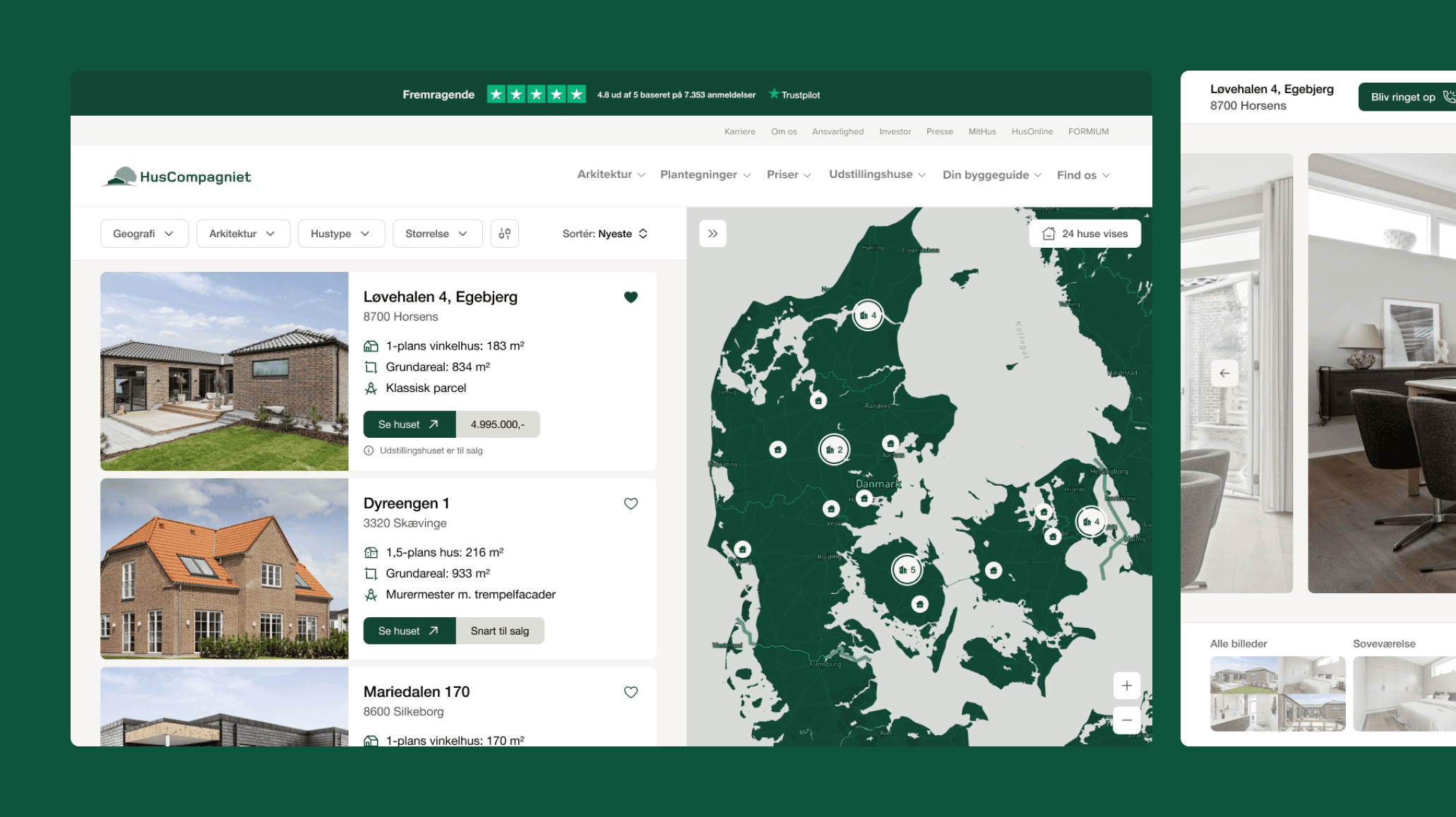
Overview
Huscompagniet is one of Denmark's largest house builders. A lot of their funnel runs through one page: the list of udstillingshuse — the display homes you can drive out and walk through. It's a high-intent moment; someone browsing here is deciding whether to build a house, and which one.
I redesigned that page during my time at Nørgård Mikkelsen, where Huscompagniet is a client. The spine of the design is a list paired with a live map, with three views the user can toggle between — so the same page works whether you're browsing by area or comparing houses head to head.
List and map, kept in sync
A display home is a physical place you have to drive to, so where it is matters as much as what it is — which is why the list and the map are never apart. The list answers "which houses?", the map answers "near me?", and they stay locked together so you never lose your place between the two.
Hovering or selecting a house in the list highlights it on the map and vice versa; clustered pins keep dense areas (Aarhus, Copenhagen) legible without losing the individual houses underneath.
Three views, one toggle
The same person browses differently depending on where they are in the decision, so the listing has three views you switch with a tap rather than three separate pages. The default list + map is the balanced middle. Floating list lets the map go full-width with compact cards over it, for browsing by area first. Grid drops the map entirely, for comparing houses side by side once location is roughly settled.
The house itself
The redesign didn't stop at the listing. Once you've picked a house, the detail page leads with a generous gallery — a hero shot plus a tiled set of room photos — so the home reads at a glance before any scrolling.
Opening the gallery drops into a full-screen viewer organised by room — soveværelse, køkken, stue, terrasse — so you can jump straight to the kitchen instead of paging through forty photos in capture order. It's a small change that matches how people actually evaluate a house: room by room.
One coherent product
The list-and-map spine, the view toggles, and the room-organised gallery share the same logic and visual language, so the experience holds together however someone chooses to browse. It's a single, resolved design — worked out down to the interactions and ready to hand to engineering.